1.2 Load the dashboard with context
Go from "here's our server traffic" to "here's how our sales campaign is performing"
The dashboard is pretty good so far. It shows large, easy-to-read stats, request volumes, errors, and more. It also shows traffic during a sales campaign.
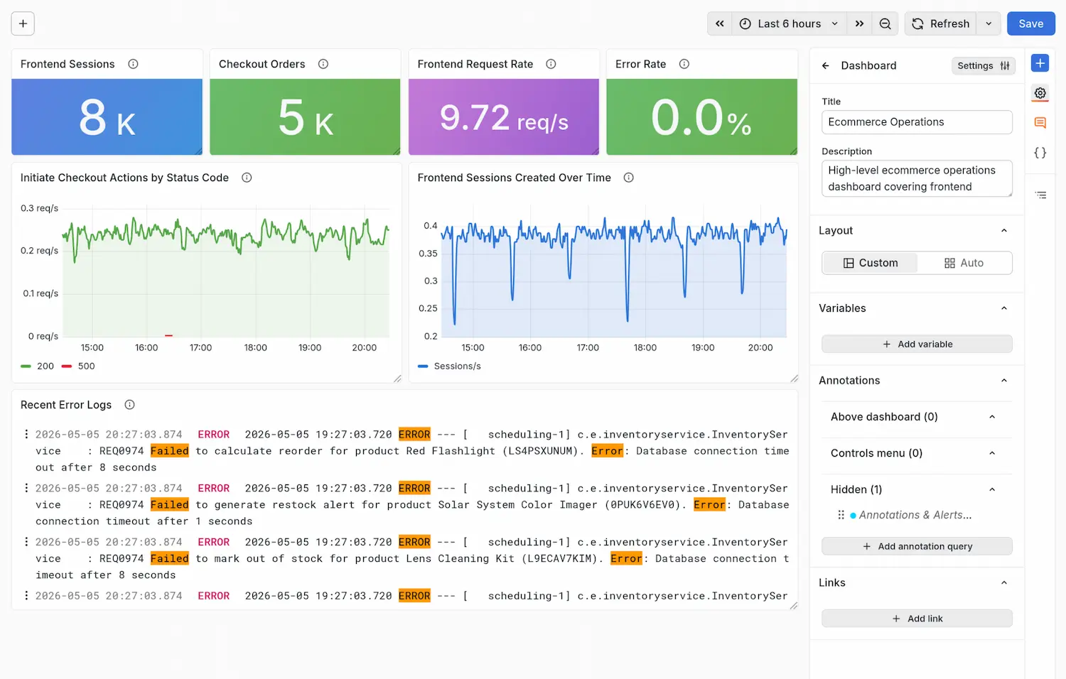
But your operations director wants to know: are we actually converting that traffic into orders? And what external factors might be affecting sales performance?
The dashboard looks good... 👍 but can we pull in sales data?
In this lab, you'll see how to add more data sources to a dashboard, to turn it from a technical tool into a single pane of glass that shows the health of your systems and business.
What you'll build: A dashboard that combines operational data, business data, and external context into one coherent campaign view.
Task 1: Pull in orders data from MySQL
Features: MySQL data source, Global variables
The orders database (MySQL) is the source of truth for completed purchases. In this task, you'll two additional panels that show:
- Orders during this time period (from MySQL)
- Revenue this time period (from MySQL)
These two panels, side by side, will tell an interesting story: if traffic is high, but revenue isn't, something is wrong.

Web analytics tell us how much traffic we have, but our ecommerce orders database tells us whether that traffic is buying. Grafana isn't just the place to see your server metrics -- it's your home for visualizing everything.
Panel 1: Add orders this time period
-
Open the Assistant sidebar.
-
Enter the following prompt:
Suggested promptPlease add a stat panel showing the total count of orders. Query the MySQL orders table and count all rows where the order_date column falls within the dashboard time range, using the $__timeFilter() variableWhat's the 'timeFilter' global variable?The
$__timeFilter()keyword is a special, global variable in Grafana. It adds a clause to the current query, to filter data by the time range selected at the top of the dashboard. This allows us to show only orders which were created during the selected time range. When used with the MySQL datasource, it automatically injects the correct syntax - neat!See https://grafana.com/docs/grafana/latest/visualizations/dashboards/variables/add-template-variables
-
For your information: Once the panel has been created, try opening the Edit view and looking at the query. Since our dashboard is time-based, we use a special Grafana variable to fetch only data from the selected time range:
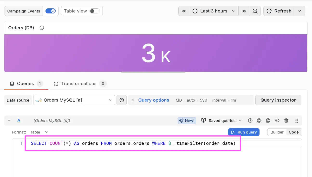
Nice job. You've just added a new panel to the dashboard which shows the number of orders during the selected time range!
Curious how to do this without Grafana Assistant?
-
Click the Add new element icon (the blue plus sign) in the top-right corner, then click or drag a panel onto the dashboard.
-
Set the Title to
Orders this periodthen click Configure visualization. -
In the Queries tab, use this query:
-
Change the datasource to Orders MySQL.
-
Switch the query editor to Code mode.
-
Paste this SQL:
SELECT COUNT(*) AS total_ordersFROM orders.ordersWHERE $__timeFilter(order_date)
-
-
Change the visualization type to Stat. The picker opens on the Suggestions view — click All visualizations first, then choose Stat. (Search doesn't work while you're in the Suggestions view.)
-
(Optional) In the panel properties sidebar, click the Search icon, and search and set the following properties:
- Search for
unitand set Standard options -> Unit to Short. - Search for
colorand set Stat styles -> Color mode to Background Solid. - Search for
colorand set Standard options -> Color scheme to Single color, then pick any one of the preset colors from the swatches at the top of the color picker.
- Search for
-
Click Back to dashboard, and drag the panel into the top row, resizing the other panels as necessary.
-
Save your work!
Panel 2: Add revenue this time period
-
In the Assistant sidebar, enter the following prompt:
Suggested promptPlease add a another stat panel, similar to the orders this time period panel, showing total revenue. Query the MySQL orders table and sum the total amount for all rows where the order_date column falls within the dashboard time range, using the $__timeFilter() variable. -
Assistant should create a new panel, similar to the previous one, but showing total revenue instead of total orders.
Curious how to do this without Assistant?
-
For the Orders this period panel, click the More icon in the top right corner, and click on Duplicate.
-
Set the title to
Total sales this period. -
Edit the panel and change the query to this:
SELECT SUM(total_amount) AS total_revenueFROM orders.ordersWHERE $__timeFilter(order_date) -
(Optional) Let's style the panel! May we suggest:
Search for Set property To value unitStandard options -> Unit Currency -> Dollars ($) colorStat styles -> Color mode Background Solid colorColor scheme Single color colorColor Green -
(Optional) Finally, drag the panel into the top row, resizing the other panels as necessary.
Review the dashboard
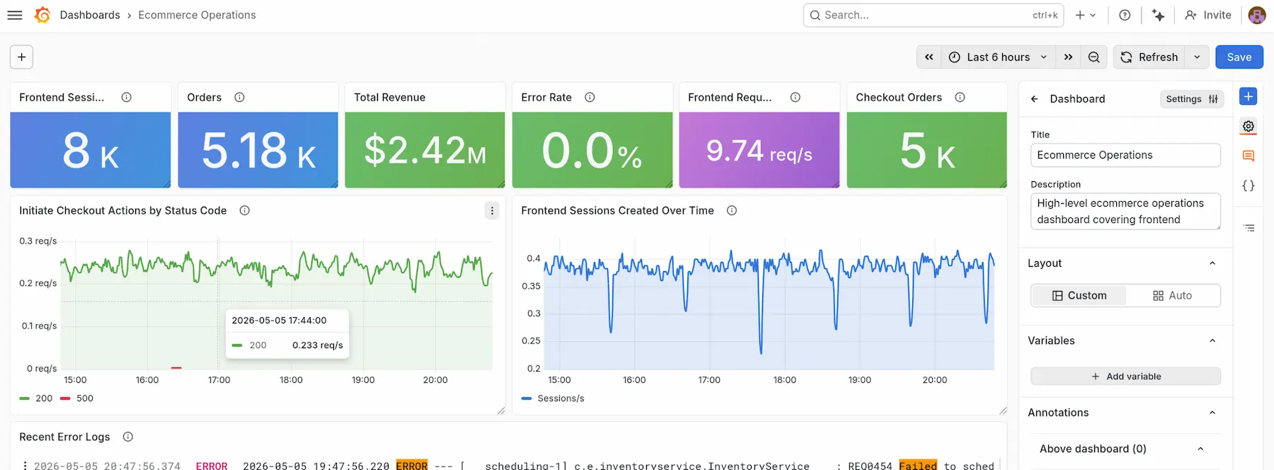
Admire your handiwork so far! Now we have:
- operational metrics (sessions, errors)
- business metrics (orders, revenue)
so we can begin to understand not just how much traffic we have, but also whether that traffic is converting into sales.
Task 2: Correlate sales campaign events
Features: Infinity data source, Annotations
Sometimes, you might see a spike in traffic or orders, but you don't know why.
In this task we'll mark out some relevant events on the dashboard. We'll use Grafana's Annotations feature, combined with the Infinity data source plugin, to draw bars on the dashboard with events from our marketing automation software, so we can see when a flash sale is going on, and how it might affect our revenue.
Now when the sales director sees a spike in orders, they know why: because an email went out.
The Infinity data source is a data source in Grafana that allows you to pull in data from almost anywhere.
Annotations don't have to come from a metrics or logs backend. With Infinity, any HTTP endpoint returning the right shape of data can work as an annotation source.
Add the annotations
Follow these steps to add the annotations:
-
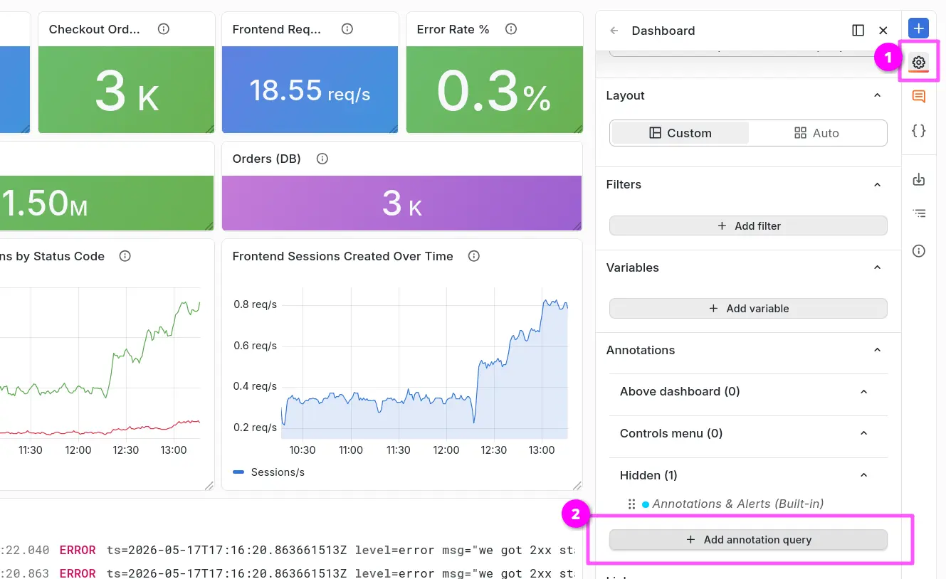
Open Dashboard Options (gear icon) → Annotations → Add annotation query.
-
Set Name to
Campaign Events, then click Open query editor: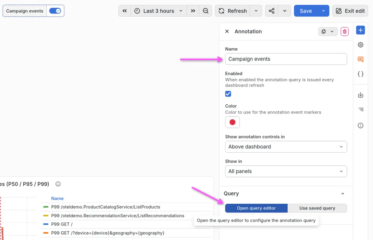
-
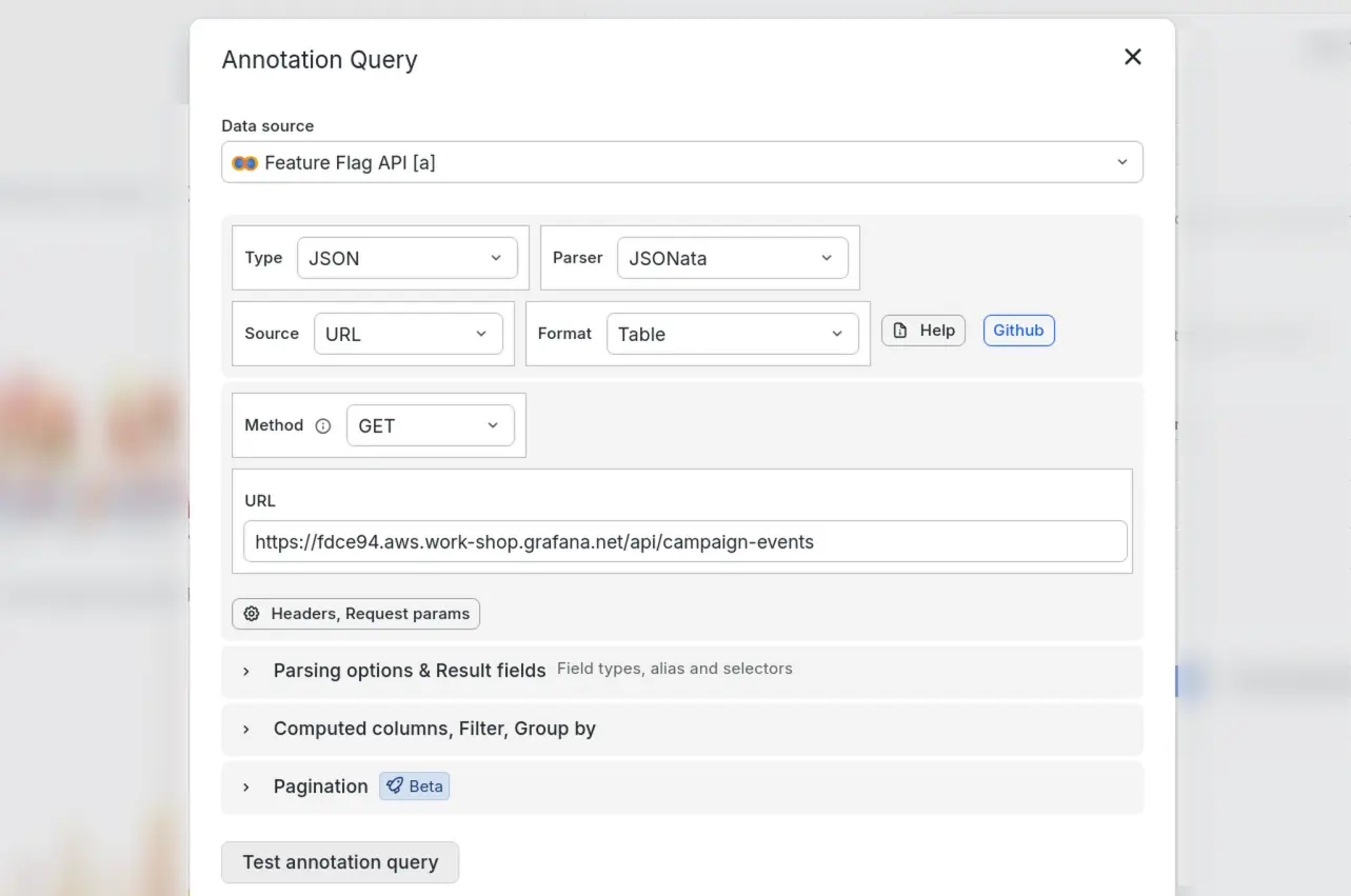
Configure the annotation query:
- Data source: Feature Flag API
- Type: JSON
- Parser: Backend -> JSONata
- Source: URL
- Format: Table
- Method: GET
- URL:
https://<ID>.aws.work-shop.grafana.net/api/campaign-events(replace<ID>with your workshop ID - if in doubt, ask your facilitator!)
-
Click Test annotation query to verify that the query is working, then Close the query editor.
-
Optionally, change the Color to a color of your choice that will stand out well in your dashboard's color palette.
-
Ensure the annotation is Enabled using the checkbox.
-
Click Save.
Review the annotations
Go back to your dashboard and look at the time series panels. You should now see vertical lines marking when the campaign launched and when each email was sent. Now we can understand exactly why traffic and conversions have suddenly increased.
If you don't see the annotations, try refreshing the page.
Hover over an annotation line to see its title and description:
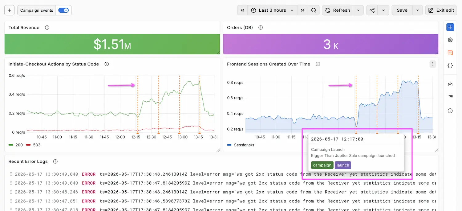
Grafana automatically maps the time, title, tags, and text fields from the JSON response to annotation fields. These are the field names Grafana looks for by convention. Annotations can also contain HTML, so that they can be styled and formatted.
Switch them on and off
These annotations can be toggled on or off. Just click the Campaign Events toggle at the top of the dashboard to show or hide them. This feature is useful when you want to see a clean view of the data without the annotation lines, or if you are sharing a dashboard with different audiences who may not need the campaign context.

Wrapping up
Annotations in Grafana are a great way to add context to your dashboards. Annotations are vertical lines plotted on top of time series panels to mark specific events or periods of time. This helps users correlate changes in the data with real-world events.
Without annotations, every unexpected spike might require contextual knowledge. But with annotations, you can pull in events from anywhere, like:
- pod restarts
- database errors
- new feature launches
You've seen how to:
- Use Grafana's plugin ecosystem to pull in data from almost anywhere
- Correlate business performance (orders, revenue, revenue per visitor) alongside system health
- Leverage Grafana's support for third-party APIs to add campaign event annotations onto charts – so that order spikes and dips are never a mystery
You're done with this lab! In the next lab we'll see how to use transformations to combine and polish your data to make it even more useful.