Banner
#Banner
ready
Banner notifications show high-importance messages, such as alerts of the product, not a specific task – They persist until dismissed by the user, or if the alert has been resolved.
Do’s
- Are sticky, and should scroll with the content page.
- Can appear just once at a time.
- Are displayed below the top navigation bar.
Don’ts
- Do not cover the content with a banner notification.
- Do not show more than one banner at a time.
- Do not use text links as an action.
When to use
- To inform users about general notifications for the product.
- To show a high priority message that needs to be resolved.
- Need to update/upgrade the product.
- The trial is about to expire.
- Use banner notifications when the system state requires a call to action.
Call to action
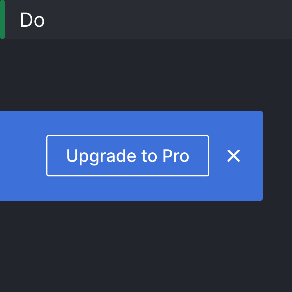
Use the outline button as an action.
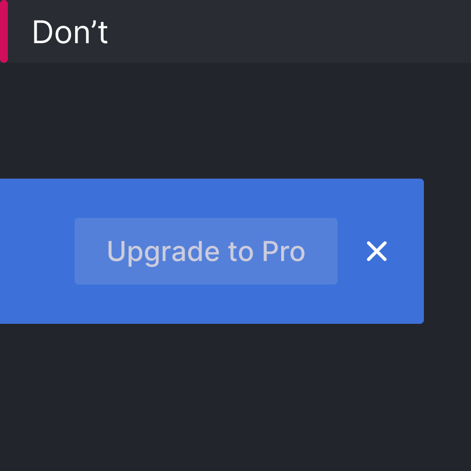
Do not use the default button style.
Body content
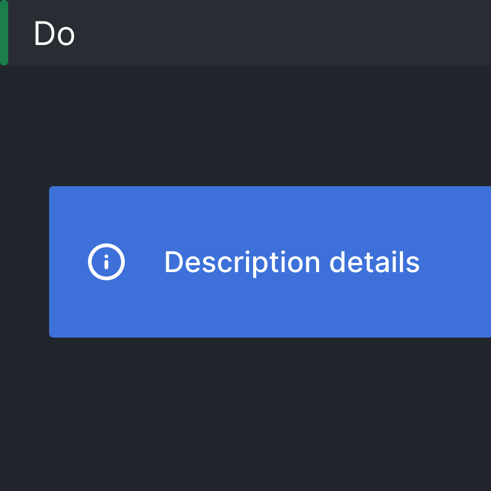
Use one line for the body content.
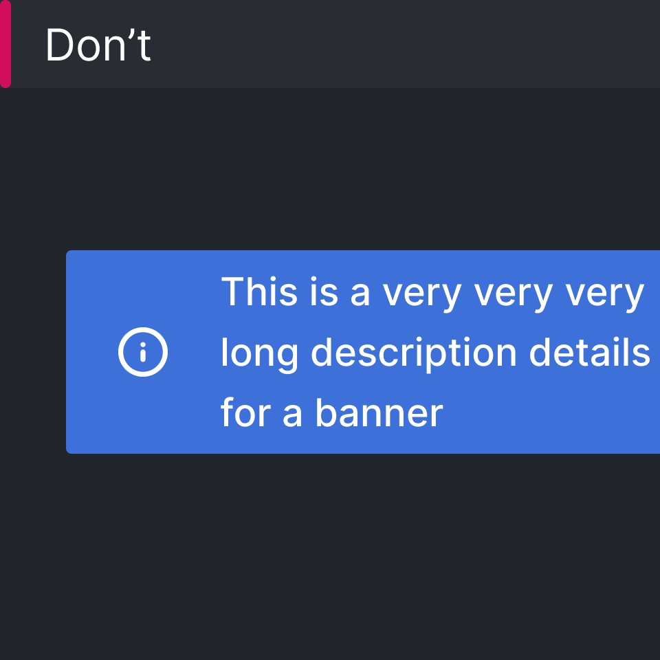
Do not use more than one line.
Content
Banners usually inform the user of a change in system status, not related to a specific user’s task.
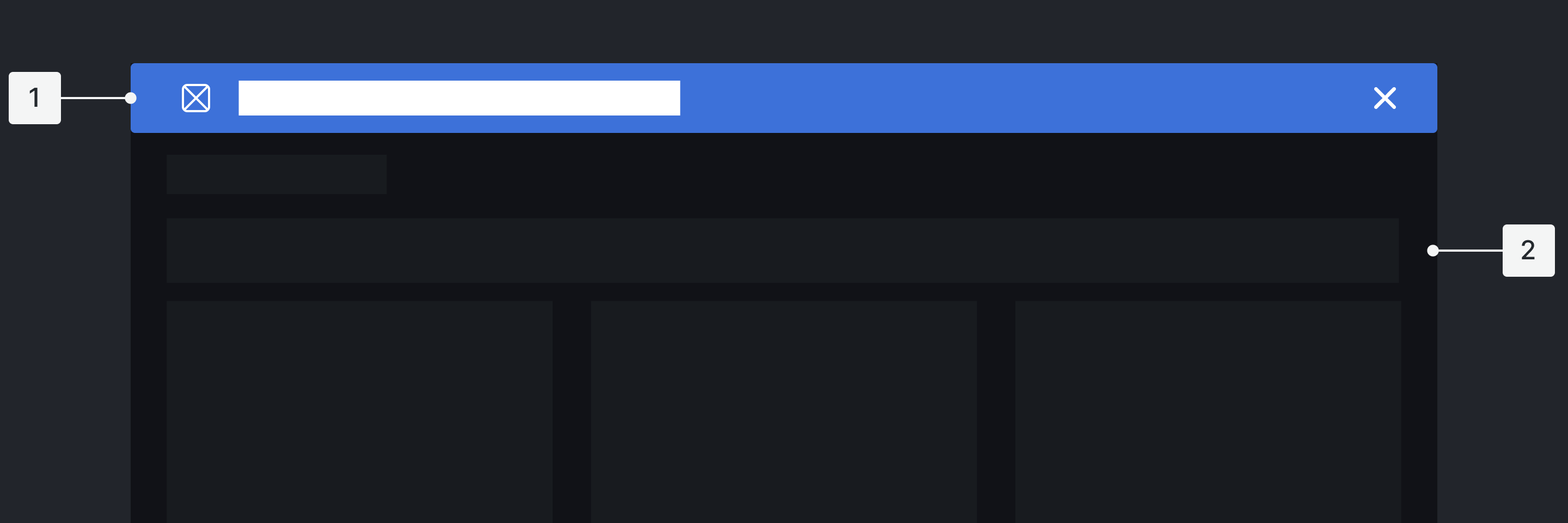
Main Elements
- Icon
- Alert Copy/Title
- Button or text links
- Close icon [x]
Placement
- It appears at the top of the interface, as sticky.
- Banner notification
- Landing page with their content area