Tooltip ready Storybook
Tooltips display additional information upon hover or focus. The information included should be contextual, helpful, and non-critical to the user’s task-at-hand. The information should be concise and provide clarity to the user.
Usage
Do's- Provide supportive, explanatory text for icons (i.e, “search” as a label for a magnifying glass icon)
- Concise information around intended use of element
- Allow tooltips to be triggered by keyboard navigation
- Use arrows to indicate which element the tooltip is related too
- Use tooltips consistently (i.e. icon buttons have them, all tooltips are styled the same)
- Use ARIA tags when building tooltips to ensure they are accessible
- Do not house information critical to user’s task completion
- Do not duplicate information such as calls to action labels creating information pollution
- Do not use interactive components within a tooltip
- Do not make the user dismiss the tooltip
Variants
| Variants | Purpose |
|---|---|
| Info (aka default) | Provides contextual supportive information to the user |
| info-alt | Not sure on what this is |
| Error | Acts as inline validation |
Accessibility
- Use ARIA tags when building tooltips to ensure they are accessible
- aria-labelledby if the tooltip works as a primary label (i.e. to name an IconButton action)
- aria-describedby if the tooltip works as a supporting label (i.e. to give additional information on an input)
- Tooltips must be visible when their trigger is tabbed to/focused on via keyboard navigation
Formatting
Anatomy

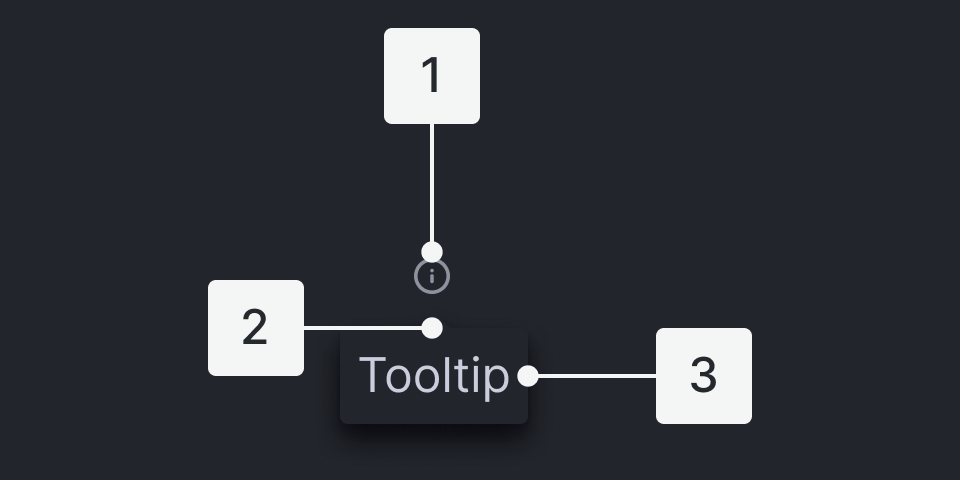
- Trigger - the UI control users interact with to display tooltips
- Tip - the triangle piece that points to the trigger element
- Body - the container that houses the content of the tooltip
Placement
- Auto: displays tooltip on side with most space available available
- Auto-start: aligns to the top of the trigger
- Auto: aligns to the center of the trigger
- Auto-end: aligns to the bottom of the trigger
- Top
- Top-Left
- Top-Center
- Top-Right
- Bottom
- Bottom-Left
- Bottom-Center
- Bottom-Right
- Left
- Left-Top
- Left-Center
- Left-Bottom
- Right
- Right-Top
- Right-Center
- Right-Bottom
Content
Main Elements
Trigger - the UI control users interact with to display tooltips - standard info-circle icon
Tip - the triangle piece that points to the trigger element
Body - the container that houses the content of the tooltip
Behaviors
Triggers
- icons (commonly information icon
- buttons
- links
User Interactions
Tooltips are triggered when the mouse hovers over or focuses on the UI trigger. The tooltip persists as long as the mouse remains over the active container or the UI trigger or there is focus on the active container or UI trigger. The tooltip is dismissed by hovering away or moving focus to another element.
Related
If interactive elements are needed, consider using a ToggleTip